


*This case study was made for job applications only*
Decentralized asset protection made simple.
Ancient Romans called on Arculus, the god of safes and strongboxes, to protect their cherished possessions. Today, Arculus, owned by CompoSecure (NSDQ: CMPO), is the contemporary incarnation of this vigilant deity, safeguarding your critical digital assets and identity. My team and I were tasked with redesigning their web presence and design library.
Site name:
Arculus
Role:
UX Designer
Year:
2024 - 2025
The Challenge
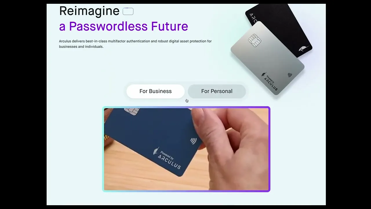
Arculus is a decentralized finance and cybersecurity platform with B2B and B2C offerings. Their white-labeled crypto wallet is only accessible through a physical hardware key, a metal card manufactured by their parent company, CompSecure. We were tasked with redesigning the client’s website to highlight their B2B offering better and building a scalable design system and UI library for future use. Our team included three UX designers (including me), a content writer, and three developers. Just three months after launch, the web traffic has doubled, attracting 150,000 visitors during August.
Process
To ensure a thorough and holistic approach, our team utilized an agile framework.
Empathize: We put ourselves in the user's shoes to understand their current journey, thoughts, actions, motivations, and any points of contention.
Define: We clarify problems that need to be solved and the goals / KPIs that need to be achieved.
Ideate: We outline potential solutions to the problems defined in the previous step using clever visual design, proper UX strategy, and data-informed decision-making.
Prototype: We bring solutions to life through thoughtful interaction design. To remove any ambiguity during development, it's important to remain as detailed as possible when prototyping.
Testing: We collected real data on the effectiveness of our decisions, which is paramount to continuously improving your strategy and refining the product.
Research & Discovery (Empathize)
Tools used:
Secondary Research
Web Traffic Analysis
Competitive Analysis
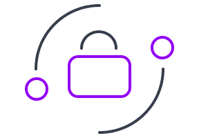
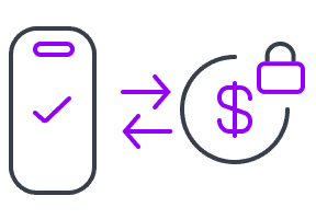
When we first took on the project, we had a clear grasp of the product's goal but a limited understanding of the problem space. Therefore, we conducted secondary research to explore the product landscape and uncover Arculus' unique value proposition (UVP). It became clear that Arculus’ key differentiator is its unique, multi-factor security measures: "something you are, something you know, and something you have." This is enforced through biometric authentication (fingerprint or Face ID), a password, and a metal card that uses NFC technology that grants access to your finances.
With the UVP clearly defined, we then analyzed their current web traffic to uncover user behavior patterns and trends that could inform our design decisions.
The B2C funnel works well and ends in a high percentage of purchases.
Only 10% of "Book a Demo" intentions result in actual "Contact Form" submissions.
Overall, the e-commerce conversion rate is 50% higher if a user lands on the PDP page.
Competitive analysis: Getting the big picture
In conjunction with analyses, we conducted a competitive analysis against five of Arculus' largest competitors to better understand how they craft their narratives and draw inspiration from their strengths. We compared their initial positioning, messaging, and standout design decisions to identify patterns and opportunities for differentiation.
YubiKey
Tangem
1inch
Ledger
Idemia
Synthesis (Define)
Tools used:
Current Sitemap
Future Sitemap
Sitemap
We then mapped out Arculus's current site structure and proposed a future state by developing detailed sitemaps that mirrored the UX journey mapping process to better visualize and plan the user experience.
Before
After
Ideation / Prototyping
Tools used:
Sketching
Low/Mid-Fidelity Wireframes
Prototypes
Sketches
We created sketches to establish a foundational narrative for the first six pages—Home (B2C and B2B), Authenticate, Cold Storage, Use Cases, and Passwordless—as well as the primary navigation menus.
Mid-Fidelity Wireframes
We then pushed those sketches into mid-fidelity wireframes using the brand colors and copy that the client provided.
Prototyping
At this stage, I was responsible for prototyping our work to ensure the client always had a functional demo to preview and critique. This approach supported an iterative process and helped us maintain a scalable design methodology, which was crucial given the scope of 47 pages across desktop and responsive devices.
Testing and Ideation
Tools used:
Internal Testing
Design Critiques
Design System
Ideation
Through weekly internal reviews and stakeholder testing, the client provided regular feedback that guided our iterations. This agile process allowed us to move forward efficiently and begin pushing high-fidelity designs into development as pages were approved — a rhythm we continue to follow. Below are a few of the many iterations based on the sitemap.
To maintain scalability, we built a design system grounded in Arculus’ existing brand guidelines, including color palette, typography, and imagery. We also developed a custom icon set to support consistency and visual cohesion across the site.
High-Fidelity Wireframes
We completed the high-fidelity designs of all primary pages by Christmas 2024, as expected. The client feedback loop continued through April 2025 due to scope creep and additional design requests.
Just like in the mid-fidelity phase, we continuously updated a “master prototype” with approved page designs to eliminate ambiguity for the engineering team as we iterated. This also made stakeholder feedback meetings much smoother, as they always provided feedback on a product that functioned similarly to the final product rather than static images. Below is a demo of the final prototype.
The final result
We're proud to have successfully improved Arculus's web presence through preparation and strategic execution. Three months after launch, web traffic doubled, attracting 150,000 visitors in August 2025.